As the formwork was coming off the concrete of the foundation walls, “Nursery” replaced “Study” in the plan annotations for the second bedroom on the main floor of this new house in Woodinville. Construction was completed ten days after Tim and Heather’s baby arrived. Both were right on schedule!
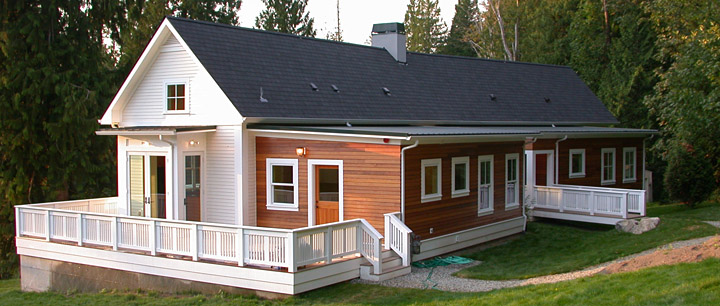
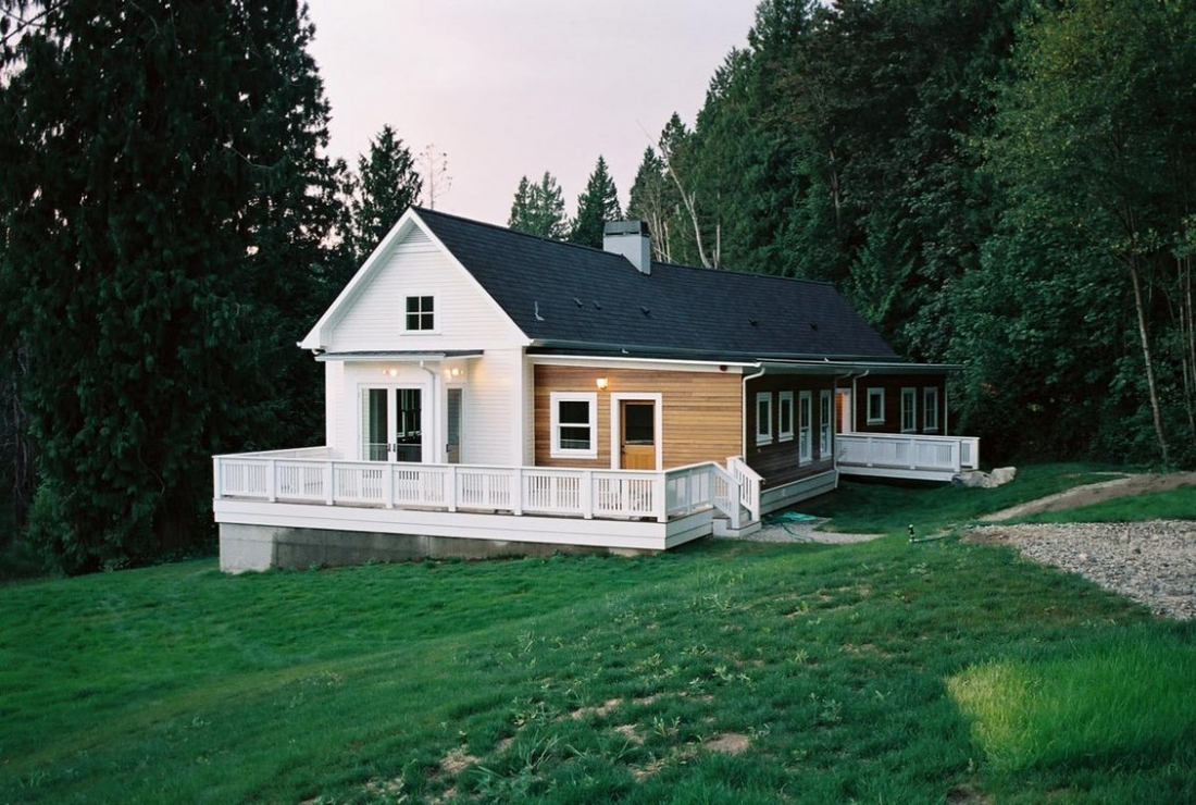
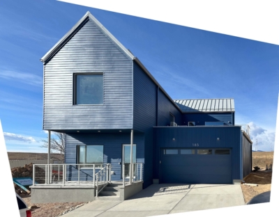
Several passersby have remarked that they thought this was a remodel of an old farmhouse. I’m flattered, since “farmhouse” was what said “home” to Tim and Heather. In plan and section however, it’s really quite unlike a farmhouse.
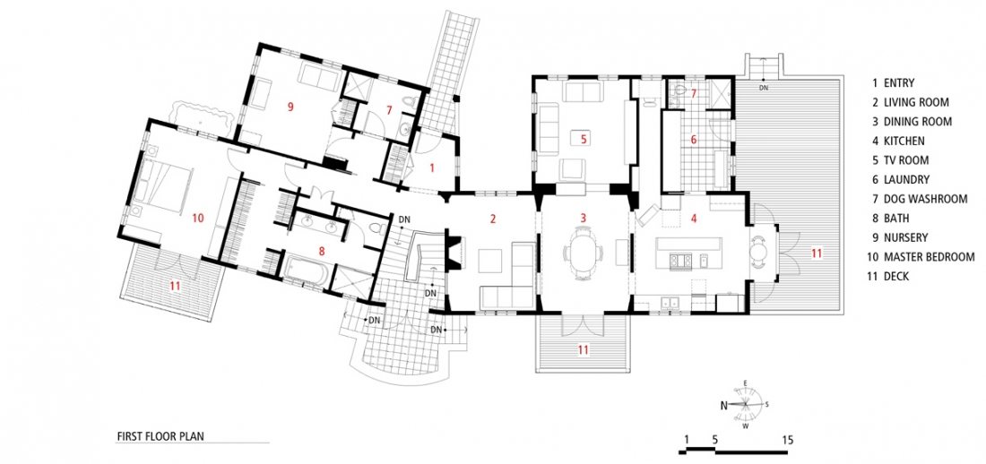
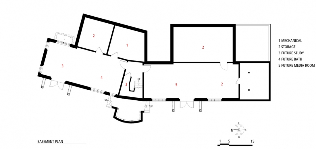
The bend in the mostly linear plan responds to site constraints in (what I hope comes across as) an unselfconscious way, like something you’d find in an Italian hill town. (Where Tim and Heather honeymooned, during the design process.) More “Oh, hey, Carlo, we need to bend this building here or it won’t fit!” than “expressing the public/private hierarchy of the house architectonically”…which, ahem, I guess it also does. The bend in combination with the topography does quite a few nice things to both the inside and outside of the house. End on, the bend conceals the length of the house, as the wing farther away disappears around the bend. Seen broadside however, from farther away on the English landscape-like site, the western side of the house is appropriately “stately”.
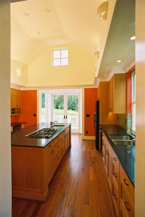
On another site we might have preferred to orient the house such that the long side of the house faced south (rather than west as it does here), but this orientation the site does result in the house being quite animated by the changing path of the sun during the course of a day. The high window in the south gable over the breakfast nook lets light deep into the great room, especially the low angle light of the Northwest winter.
The linear main-floor-plus-daylight-basement plan came from our desire to have all essential elements on one accessible floor. My clients plan on living in this house the rest of their lives, and we wanted to accommodate aging in a place without renovation.
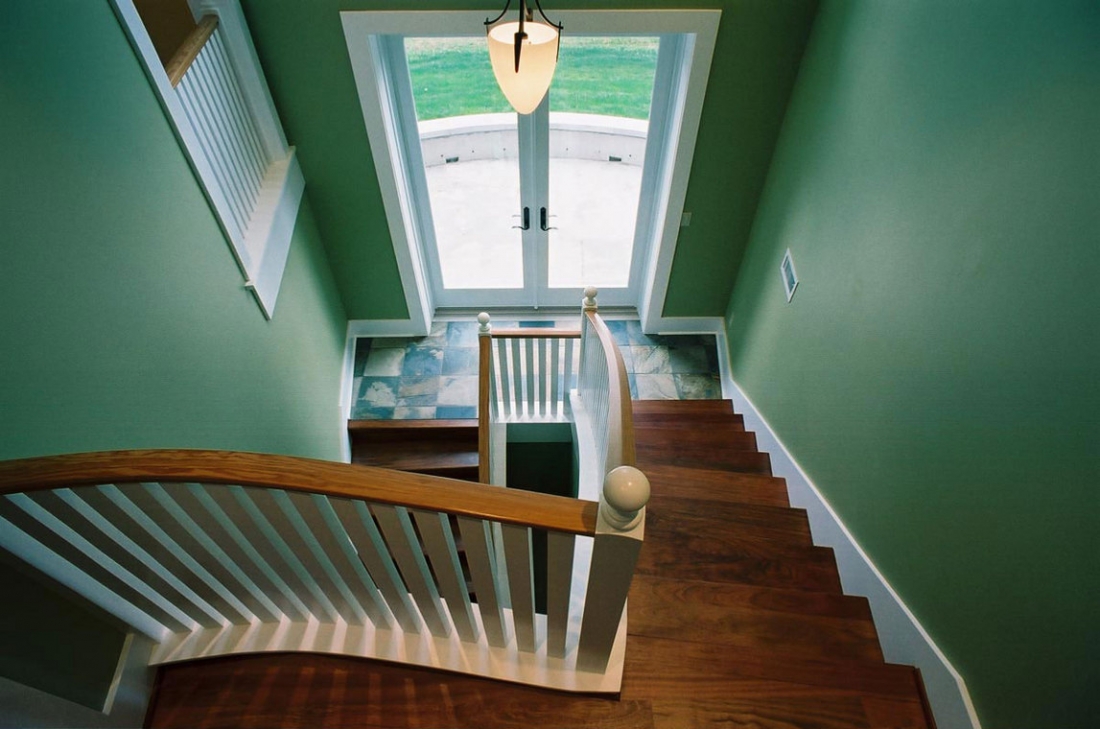
The eastern, one-story side of the house is small in scale, broken up with the two lower “sheds” sided in clear finished cedar. The accessible formal entry is across a small bridge across a bio-swale. The entry is small and low, with a place for a bench to remove your shoes. As you walk in, the space opens out and down, following the topography, the view beyond framed by two of the massive cedars on the site. French doors on the landing below open onto a small terrace.
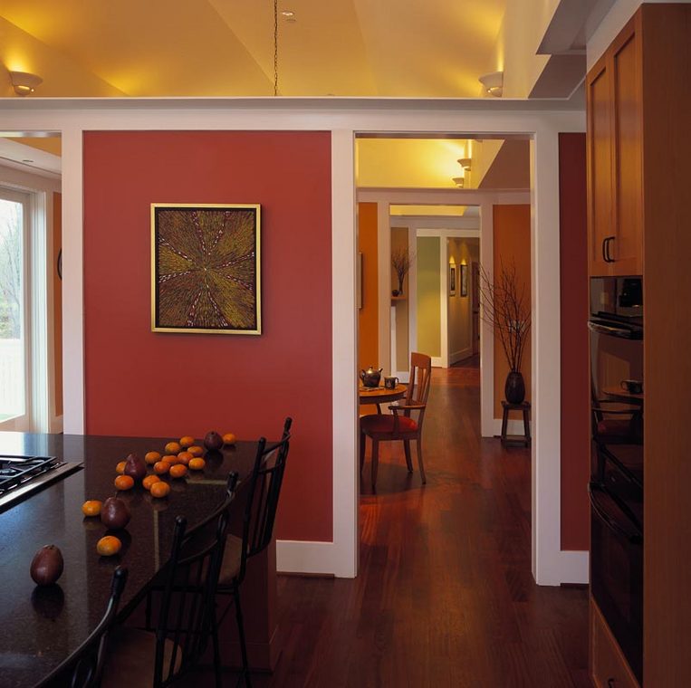
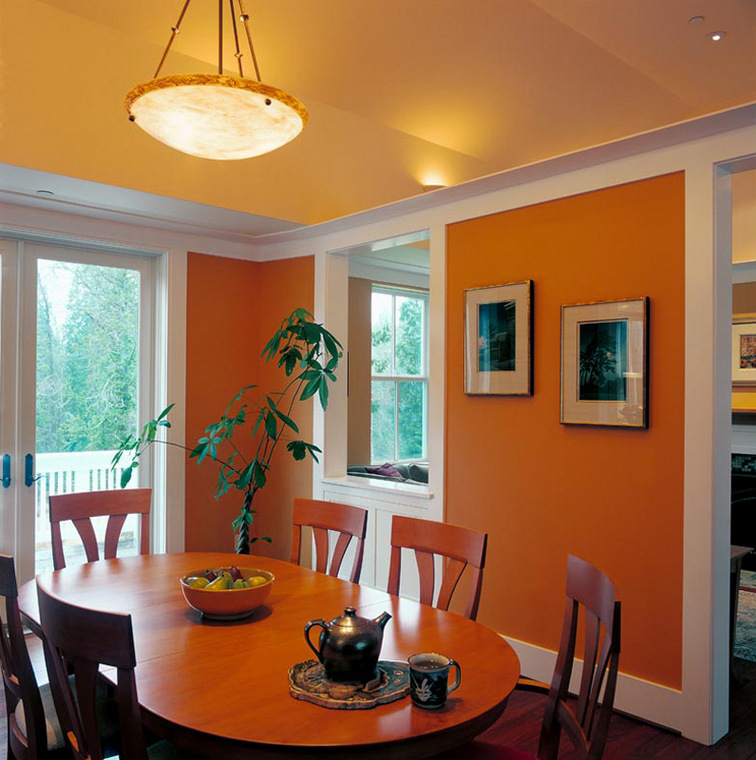
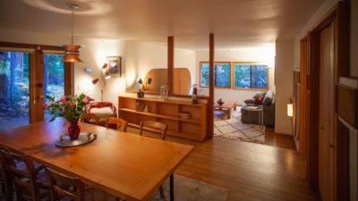
On one’s right, a hall to the private wing. To the left, a single vaulted ceiling arches over the ‘great room.’ Inspired (in a fairly distant way) by the work of architects Bernard Maybeck and Sir John Soane, screen walls divide this space into living room, formal dining room and kitchen, partially veiling what is beyond, and providing wall space for artwork.
Walking south, to the east of the dining room and down two steps is the TV Room, designed to accommodate Movie Nights, a long-standing tradition among our clients and their friends. A ‘secret room’ behind the media center allows Tim, a concert sound engineer, access to equipment as well as space for a small workbench for electronic projects. The kitchen is designed to accommodate one cook or many, with a compact work triangle on the west side of the island, but lots of chopping and kvetching space on the east side. Beyond the kitchen, a breakfast nook opens on to a large deck. In the summer the table there will likely live on the deck, while the doors can all swing open. The Dutch “back door” (likely the daily entrance) leads in from the south deck to a fairly large laundry/mud room/pantry, with an adjacent dog wash. Tim and Heather foster care stray dogs.
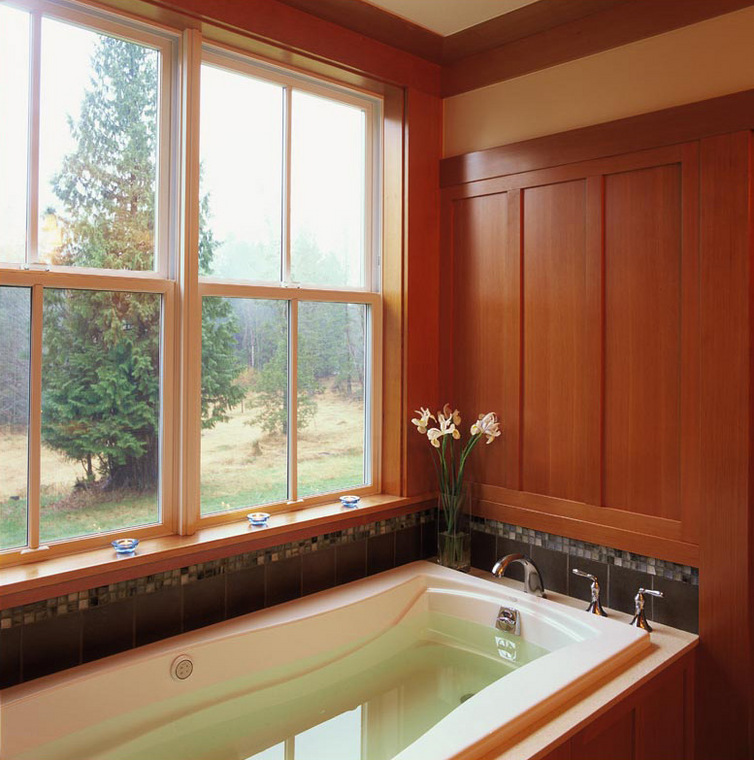
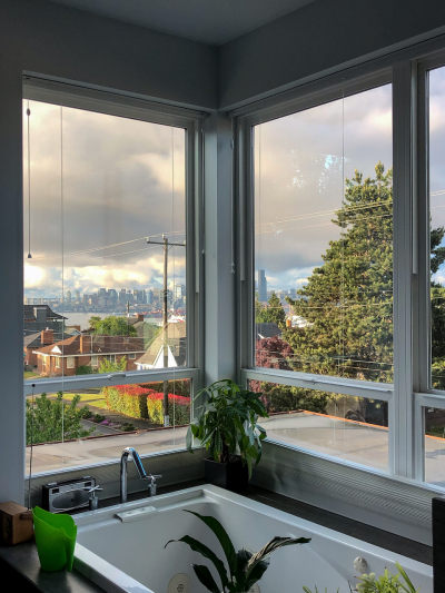
Back at the entry, if we turn right we walk through a slightly wider than normal hallway lined with artwork. Ceilings in the private part of the house are flat, and generally lower than in the public part of the house, varying from seven feet six inches (in some transition spaces) to nine feet six inches (in the master bedroom.) On your right, through a vestibule, you’ll see the guest three-quarter bath, and the nursery. A pocket door allows the bath to become an en suite with the nursery. (A left over from its Study/Guest Bedroom days during design, but something that may be useful in the future.) Continuing straight down the art hall, you reach the master bedroom suite. The bedroom was sized for a king-size bed. A French door leads to a balcony overlooking the pastoral site. The bend in the house assures that this balcony remains somewhat private. Through the walk-in closet, the master bath is compact, but has all the trimmings, including a luxurious bubble-jet tub, shower with two separately controlled heads, a separate toilet room, and long vanity with two sinks. We (Josh and I) are especially pleased with the flush medicine cabinets behind the paneling between the mirrors.

